For Mother’s Day, my church leaders gave me a tiny pink box of chocolates. I loved the triangular prism-shaped box so much I knew instantly that I would write about it on my business blog.
Allow me to take the romance out of the gift by dissecting its marketing and branding elements.
Presentation
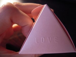
As aforementioned, I am obsessed with the little pink box I got for Mother’s Day. I didn’t think immediately of Toblerone when I took note of the box’s triangular prism shape. For one thing, the V Chocolates color scheme is so different from the distinct Toblerone yellow and red. Secondly, the V Chocolates box is much smaller and opens from one of the rectangular faces rather than from the triangular ones.
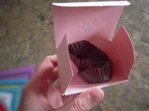
The shimmery pink color of the V Chocolates box is attractive but not ostentatious. The unique triangular shape is a delight to open and a treat to reveal two the two gourmet caramels inside. The box envelopes and protects the chocolates like a treasure chest.
I love the embossed “V Chocolates” logo on top and the words “Love” and “Life” on either side. Raised words and designs always give a tactile pleasure to gift boxes.
The chocolates looked pretty in

their pink casing. I wish I had a picture of them in the box, but I consumed them too quickly. Really, can you blame me? It was my Mother’s Day treat!
The printed words and designs on the triangular box are appropriately minimalist, showcasing charcoal and lighter pink against the shimmery pink paper. My only complaint is that the words “Best Quality,” printed in cursive, are cut in half on either rectangular side of the fold. That appears to be a design and / or manufacturing mistake, and one that could send the more anal-retentive analysts reeling.
The box is cute, unforgettable, and a real winner.
Design Features
I’m a fan of simple designs in general, especially when it comes to logos. It appears as though V Chocolates tries to communicate a sense of luxury in the simplest way possible.
As the gift box was my first point of contact with the V Chocolates brand, my first impression was a positive one. The box was cute and elegant. The chocolate was delicious, and I wanted to learn more about the company.
To a large extend, the V Chocolates brand is concise in its communication. There are a few things I find inconsistent and confusing, however.
The V Chocolate Logo
The all-caps V Chocolates logo is indeed simple and artistic, as befits the emblem of an artisan chocolatier. It is a bit hard to read, however. With the V in the background and the “CHOCOLATES” banner streaming in front, the name is not the easiest to read. It took me a while to pronounce the name correctly.
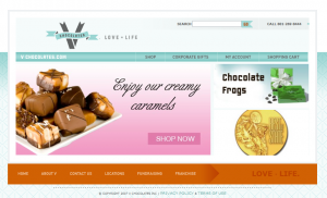
There also is a discrepancy between how the logo appears on the box versus how it appears on the website. On the box, you see the word “toffees” and to the left and the word “berries” to the right of the “V” and beneath the banner of the V Chocolates logo. However, on the website, these words to not appear. The simple “V” with the “CHOCOLATES” banner appears, with the company slogan “Love” dot ” Life” off to the right. I’m not sure if that’s a command for me to “love life,” or just two disjointed, alliterative words. The mismatch of the two logos presents a consistency problem and muddles the company’s message a bit.
The “keywords” on the box and website do more to confuse the consumer. On the box, I wonder why it says “toffees” and “berries” when the chocolates I just ate were neither. One was filled with caramel and the other filled with some creamy nut concoction.

On the home page, the picture of assorted chocolates commands me to “Enjoy our creamy caramels”. Since the picture doesn’t change to a different array of products, I’m left to think that V Chocolates are all caramels. Then I remember the creamy nut chocolate, which was not a caramel.
Confused, I click the enticing picture. It leads me to two pages I can browse of their caramels. When I click the “Shop” link, I realize they have many more items: truffles, dipped fruits, and other confections. It all starts to make sense, but I wonder why the “toffees” and “berries” were emphasized on my box of one caramel and one creamy nut chocolate. I think they would have been better omitted from the box, especially since the logo on the website doesn’t match the one on the box. V Chocolates has nice times as many varieties of confectioned apples as it has of berries anyway. (In fact, it only has one type of chocolate covered berry of any sort, that that’s a strawberry.)
Website & Other Products
The website is attractive enough, though the look could use a few updates. It appears as though V Chocolates puts the toffees-and-berries logo on all its gift boxes. Perhaps the company has been doing that for so many years they’re afraid to stop—or perhaps they printed too many boxes years ago and have to use them all up before the logos can start matching the one on the website.

In any case, V Chocolates has an attractive selection of gifts, which they label as “corporate gifts” on their site. I wonder where the regular consumer gift tab is. Perhaps they didn’t see the need to have one, though I would question the logic behind that decision.
The photographs of their other gift options are appealing and well laid-out. I like the different colors and creative ways the different boxes open. A chocolatier’s attention to such details is very important to consumers of artisan chocolates.
In sum, V Chocolates is a cute and crafty chocolatier company. I hope I get to enjoy more of their products soon!
